Left: The melting ice lolly in the scene reflects on the slow drowning death of Cissy's husband. The film cuts to the ice lolly twice during the death, finally melting when her husband is dead. I loved the concept behind this and how it was a subtle representation of such a dramatic scene.

Initial thoughts for themes which could relate to my editorial illustration were; the hint of red on Cissy's beret which is a key feature of her character, lies, deceit, sexual dissatisfaction, and obviously the idea of death and deterioration.
From this I created a few visual responses to get my ideas flowing. These are extremely rough but portray my thought process when deciding on a final outcome.
After my initial thoughts I then decided to feature the ice lolly in my illustration as a main reflection of the scene. This included two ice lollies next to each other in composition (as seen top right), with one whole and the other melted almost completely. This was intended to convey Cissy as a dominant figure (left ice lolly) which over-powered, and eventually killed, her husband by drowning. I deliberately used watercolour for this to gain the textured effect of a real ice lolly, and also it made it possible to use the wet-in-wet technique to enable me to portray the melting effect of the lolly. Red tones were also used to imitate danger and blood, but also the significant red beret Cissy's character wears throughout the film.
My final process of creating my editorial illustration was experimenting with digitalising one of the images in Photoshop.
Altering the brightness and contrast of the image immediately made it look and feel more complete. I also saturated the tone slightly as I felt the image was too bright for the Sight and Sound magazine I was illustrating for, who generally use more muted tones.
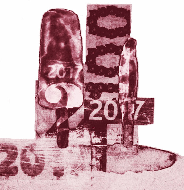
As a complete editorial illustration I didn't feel like the image was complete at all. Therefore, I took a collage I had previously done and experimented with layering and altering the opacity in Photoshop. This gave the illustration a more complete composition for the double page spread layout.
Finally, after altering various aspects of the layered image, I came to a visual standard which I feel is appropriate for the magazine I was designing for.
 |
| Final editorial image |
Overall, I am pleased with the final outcome of this project and feel that working quickly is a positive way of working as it forces me to concentrate on my ideas and visual process without over-thinking too much. As well as this, through making this illustration quickly, it has opened up a new style of working for me which I will consider continuing into my main Black Mirror project.


No comments:
Post a Comment