Sunday 23 February 2014

Nature in Watercolour

As a development of my project, I was keen to explore more traditional medias in my work and steer away from photography as I felt that personally, this was a generic way of working and there was not a lot of room to re-invent the imagery beyond Photoshop filters.

Therefore, I explored the use of watercolour to innovate my work, starting with re-inventing two of my primary source photographs:


The watercolours I have created are visually stimulating due to their subtle colour and delicate lines. I deliberately avoided adding too much detail as I want the viewer to be able to interpret the imagery with their own imagination and almost 'fill in the gaps'. This is important in my work as I feel it portrays a sense of elegance which I find harder to create in any other media than watercolour. Suddenly the elements of nature are out of context, avoiding being too literal and inventing an innovative style which can be viewed from many perspectives.

I believe this method of working is innovative due to the way the watercolour is allowed to take its own forms, creating new imagery with a reference of the original. The new forms are completely new through the way in which they are painted, this is biomimicry in art as I have taken an element of nature to re-invent them into something new.


Thursday 20 February 2014

Photography Edits in Photoshop

Using Photoshop, I manipulated my primary source photography to alter the tones which give different moods, almost changing the context of the natural form.


Whilst these Photographs above are of the same plant, they are captured and edited in unique, innovative ways. The image on the left presents a calm atmosphere with the orange tones, hinting at a morning sunrise. The image on the right is darker and appears more mysterious. The sharp white of the plant cuts through the darkness, creating a strong image.


The image above is more simplified with its black and white tones. The plant almost imitates a 'scribble' in the air. I love the natural delicacy in all of these images which the camera has captured. The different colours emphasise a variety of moods which the viewer can interpret.


On my venture to Castle Hill, I actually found and photographed some burr plants which were initially used by George de Mestral to inspire him to create velcro. It was intriguing to see them in person as when I photographed the oddly shaped plants and edited it in Photoshop, it gave a sense of futurism. Even the background gives a sense that they are on another planet.


These images are cropped versions of the original close up dead flower which was photographed indoors. The pink is natural and unedited whilst the blue tint on the left image gives a more subtle hint of tones and a greater sense of elegance and calm.


Simply rotating an image proves to be effective as this one imitates a flame, when in fact it is a leaf. Changing the colour to reflect its new shape instantly puts the natural leaf in an entirely new context.


The edit of the left highlights the line in the image, framing the individual petals. This was created using a gradient filter in Photoshop. The photo on the right is more natural looking, it almost appears at though a bright morning sunrise is shining down onto the petals, highlighting their beauty.

I believe that editing the photographs was a success, there a some new innovative approaches to standard photography which are unique and re-contextualise some of the nature. This kind of approach could be adapted to traditional media artwork inspired by this photography.

Friday 14 February 2014

Second Visit to 3M Buckley Innovation Centre

As a course, we visited the 3M Buckley Innovation Centre for the first time. Even though I had already looked around the accessible parts of the building, this visit allowed us to view more of the room and the 'Innovation Avenue' on the ground floor.

As a group, we considered the questions on the Commission Checklist we created with professional practice lectuer, Lee Corner.

First, there was a presentation by the client herself, Liz Towns-Andrews. On the initial screen I noticed typography collage in purple, grey and blue tones which could hint at the colour scheme of the building/ company. The room where we sat (one of the commissioned rooms) was very spacious and light with bare walls. It would be ideal for a few large scaled artworks or several smaller artworks.

Once the presentation had begun, I picked on some main points presented by the client: 

  • State of the art innovative work- present image of concept of 3M
  • Different from any other enterprise centre that works with other businesses, partnership
  • Recognised internationally
  • 'Establishing in an 'ecosystem' to promote business growth, open innovation
  • Access to supply chain networks- markets, finance, technologies and skills
  • Networking exhibition space
  • Workshops/ labs
  • Meeting rooms
  • 'Open innovation principle'- getting knowledge from different companies
  • Innovation Avenue- dedicated equipment, complimentary to University- dedicated for business use; flexible access arrangement; presenting businesses with new technology; metrology- surface metrology
As soon as the main presentation was over, we were allowed to ask several questions. Here are some notes I picked up on based on Liz Towns-Andrews personal interests:


  • Passionate- art, engineering, science
  • Can use any media
  • Crystallography
  • Fractals
  • Getting knowledge out of minds and into businesses
  • Cloud computing- moving forward
  • Social networking
  • Fluid dynamics
  • 3D printing
  • Artist in residence-connection
  • Biomimetics
  • Art will not be permanent, perhaps a year
  • Smaller pieces in meeting rooms, multiple pieces- triptych
  • 20-30 works will be selected for commission
  • Open to animation/ video- 3D TV could be used
  • Sherat- pointillism
  • Green technology
  • Thought-stimulating pieces

After the client expressed her own interests, I was glad to know that she was intersted in biomimicry, a topic I had initially been working on beforehand. All of the information Liz provided was very helpful and it was made clear that the brief is quite open. After the talk, we were then taken on a tour of the building including some of the state of the art facilities used in 'innovation avenue'.


Photography taken on the tour around the Innovation Centre:


As I had already visited the building, it was very interesting to see what was behind the doors and discover all of the activities which go on inside. Although the main focus of the company seemed to be science based, I was sure that I wanted to avoid this route even though I had already chosen biomimicry as a starting point.

Overall, I found the talk helpful and will take aspects of the experience and apply them to my working commission to meet the needs of the client's brief.

Monday 10 February 2014

Art of Nature: Anna Atkins


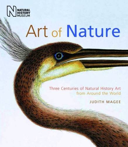
After researching into art in nature, I stumbled upon this book by Judith Magee, 'Art of Nature: Three Centuries of Natural History Art from Around the World'. 

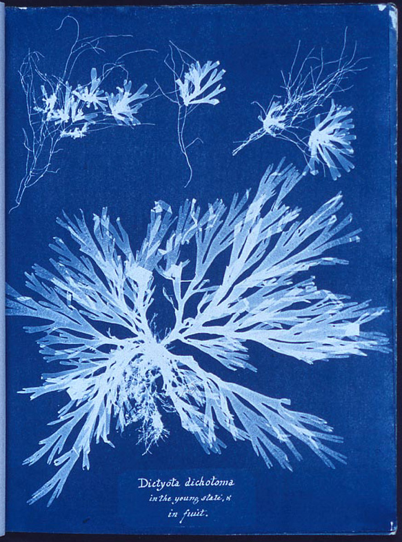
When I looked through, all of the illustration I found were beautiful but one really stood out at me: a book cover by Anna Atkins, also thought to be the first female photographer and among the first botanists to study and publish on the subject of algae. 

 
British Algae: Cyanotype Impressions completed in 1853, made up of 389 handmade photographic plates replacing traditional methods of illustration.


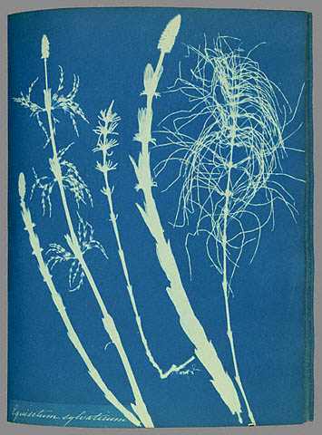
Having seen this beautiful piece of art, I looked for more of her works and found some amazing imagery.


I love the delicacy of detail in her work which presents nature in an entirely new way. After taking some of my own photography, I applied Atkins' style to my own images to see how they would look:

Primary Source Imagery: 


Photoshop manipulation to imitate style of Anna Atkins:


Once I manipulated my own photography, I really saw the detail in the flowers and leaves. They almost look translucent in their appearance which creates an interesting effect that could be applied to further development.


Thursday 6 February 2014

X-Ray Artist: Arie van 't Riet

Further research brought me to the wonderful art of Arie van 't Riet who uses x-ray images in his artwork. His main subject is on using the natural world including plants and animals and combining them to make new natural scenes made from his x-ray imagery. These vibrant images are absolutely stunning and provides a new insight into the world of nature, focusing on what the human eye cannot see and making it into inspiring artwork. 

Here is an interesting video from Ted Talks where the artist himself explains the process of developing his artwork:


Beautiful, innovative imagery made by Riet:

Original x-ray image
Poppy, penstemon, rododendron 
and lizards.

Dimensions of the original siverbromide
 negative 12" x 16" . Digitised 300 dpi, 
12 bit. In photoshop the x-ray image was
 inverted and partly coloured.

Riet has inspired me to try and look at nature in new ways as a method of innovation. This links well with Biomimicry and nature is studied in a way which is beneficial to mankind, rather than extracted from its natural habitat.


Monday 3 February 2014

Artist: Ian Phillips

Having decided to go with the theme of nature, my initial artist exploration took me to the beautiful work of Ian Phillips.

His linocut prints are original and innovative, taking nature and making it into something visually new and appealing. This approach is effective especially with his use of vibrant colours and layering technique. He also appears to simplify his landscape prints by using geometric shapes to pick out tone and texture.

"Boat wake returning home"
Original linocut
Print Size: A2 (594 x 420mm)

Phillips also explores animals in nature in his work. This simple bird with detailed, intricate patterns makes it look contemporary and unique. This interpretation of nature could be applied to my own work by simplifying forms and making detail into intricate geometric pattern.


"The Ibis of Ideas"
Original linocut
Print Size: 560 x 750mm

More of Ian Phillips' work can be found on his website at: 

http://www.reliefprint.co.uk/website_2011/linocut_pages_2013/linocut_studies.html

Saturday 1 February 2014

New 3M Buckley Innovation Blog

As we have been told to create a new blog for the 3M Buckley Innovation Centre Commission, I will focus on putting my development on the new blog and keep this blog for artist inspirations, tutorials and anything else I don't find directly beneficial for Liz Towns-Andrews who is the primary commissioner for the brief.

Here is my new blog address so you can keep up to date with my commission work for the 3M Buckley Innovation Centre:

http://3mbiccarlataylorillustration.blogspot.co.uk/

Or click image to go to new blog: