Thursday 28 November 2013

Inspiration Project Brief

Last week I was set a short project brief based on inspirations. After expressing what inspires me on a personal level on my previous blog post 'My Personal Inspirations' and sharing my thoughts with the rest of my peers at University, we were set a challenge in randomised pairs to create an illustration based on the other persons own inspirations.

I was paired up with Katie Mcternan who's personal work can be found on her blog at: http://katiemcternanillustration.tumblr.com/

Katie's Inspirations:

Nature- Andy Goldsworthy, man made vs nature (destruction of nature)- Julian Schnabel, patterns - Yellena James and Beatriz Milhazes, texture, butterflies - colour and pattern - Damien Hirst, Fiona Rae, visiting galleries, collect objects and images of things I like to make mood/inspiration boards, taking photos of things I see and like, time- decay- watching things age, experimentation with materials, life drawing, drawing.

Interestingly, I found many similarities with my own personal inspirations. Therefore, I naturally focused on these things and decided that to create my illustrative interpretation I would use the themes of nature and decaying over time. I also looked at the artists which were given and actually really loved the work of Yellena James who uses plenty of colour and pattern in her illustrations in a subtle and delicate way.

After researching and thinking about potential ideas for my illustration, I came up with an initial sketch:


The idea behind this was to illustrate how trees lose their leaves throughout the seasons. I visualised this as a form of decay and thought it linked quite well with Katie's inspirations. Furthermore, the bird signifies the beauty of nature and I thought that a bird would be a perfect icon for representation to reflect this. 

I then went on to develop this further with watercolour as my choice of media to reflect on the subtle beauty of nature.

Original watercolour illustration

Digitalised version of original illustration. Applied manipulation of brightness/ contrast, hue and saturation.


Final version of digital illustration


I believe that the final illustration I created was successful in the sense it portrays a sense of time and decay in a simple manner. The dark space gives the composition a sense of space, but also reflects the negativity of the theme of decay. The birds are almost 'dancing' in the air which gives a sense of juxtaposition and calm when the surroundings and themselves appear to be deteriorating.

Once digitalised, I feel it has enhanced my original illustration and made it stronger. It is not giving too much away and allows the viewer to interpret the illustration in their own way.

Cropping the image right makes the birds iconic without needing the rest of the image to understand the theme of decay within nature.


Reflection on Project

Overall I have found this project has given me a sense of relief from the main 'The Black Mirror' project. Forcing me to work at a fast pace has actually been a huge benefit to my approach to creating illustration, allowing me to illustrate my ideas visually without over-thinking or questioning them. As a matter of fact I believe through the creation of this illustration I can move forward with my main project and produce more visuals for my final outcomes.


Katie's Illustration based on my own Inspirations

As I was paired up with Katie for this brief, she also created an illustration based on my own personal inspirations (which can be seen on a previous post 'My Personal Inspirations').


After seeing Katie's illustration it immediately struck me how similar our compositions appeared to be, and how we both picked out the nature elements of our inspirations. We both also used watercolour as our choice of media which was interesting and demonstrated how similar our inspirations actually are. I think Katie has done a great job of depicting my personal inspirations, and how she chose to illustrate my childhood within quite a maturely painted and subtle background.


Monday 25 November 2013

Gallery Visits in Leeds


Leeds Art Gallery


When I visited Leeds Art gallery, one of the main exhibitions which was showing was 'Art and Life' 1920-1931,  a book which explores the artistic relationship between Ben Nicholson and Winifred Nicholson, as well as their friendship and collaborations with Christopher Wood, Alfred Wallis and William Staite Murray.

When looking around the gallery, the paintings seemed quite abstract and often featured nature as a dominant subject. I felt like a lot of the techniques by the artists Ben and Winifred Nicholson were quite childish when viewed beside one another. Personally, I didn't see a lot of technical skill involved in their paintings which made them difficult to view in a positive way.

Christopher Wood's Cumberland Landscape
The work of Christopher Wood was more intriguing with his 'Cumberland Lanscape' and use of bold colour. It is evident that he has used quick mark making techniques to gain a sense of movement within his painting. The overall painting has a child-like quality to it, though as a viewer we know that it is much more technically advanced. 

Cornwall: Feock and St. Ives

Ben Nicholson- "a sleeping beauty is countryside of southern foliage, sheltered creeks and wide expanse of water"

Nicholson met Alfred Wallis at St.Ives, therefore a lot of his work is inspired by this part of the country. This wonderful quote expresses his love for the countryside and the way this vision is put into his paintings.

Christopher Wood's Pill Creek
Another painting which caught my eye was Christopher Wood's Pill Creek 1928. 

Wood used oil and pencil on canvas for this painting, emphasising his use of mark making techniques. It appeared that when viewed up close, Wood had scratched back into the oil paint over several layers. This painting appears more detailed than some of his other works, though there is a greater sense of ability t capture the notions of the countryside.

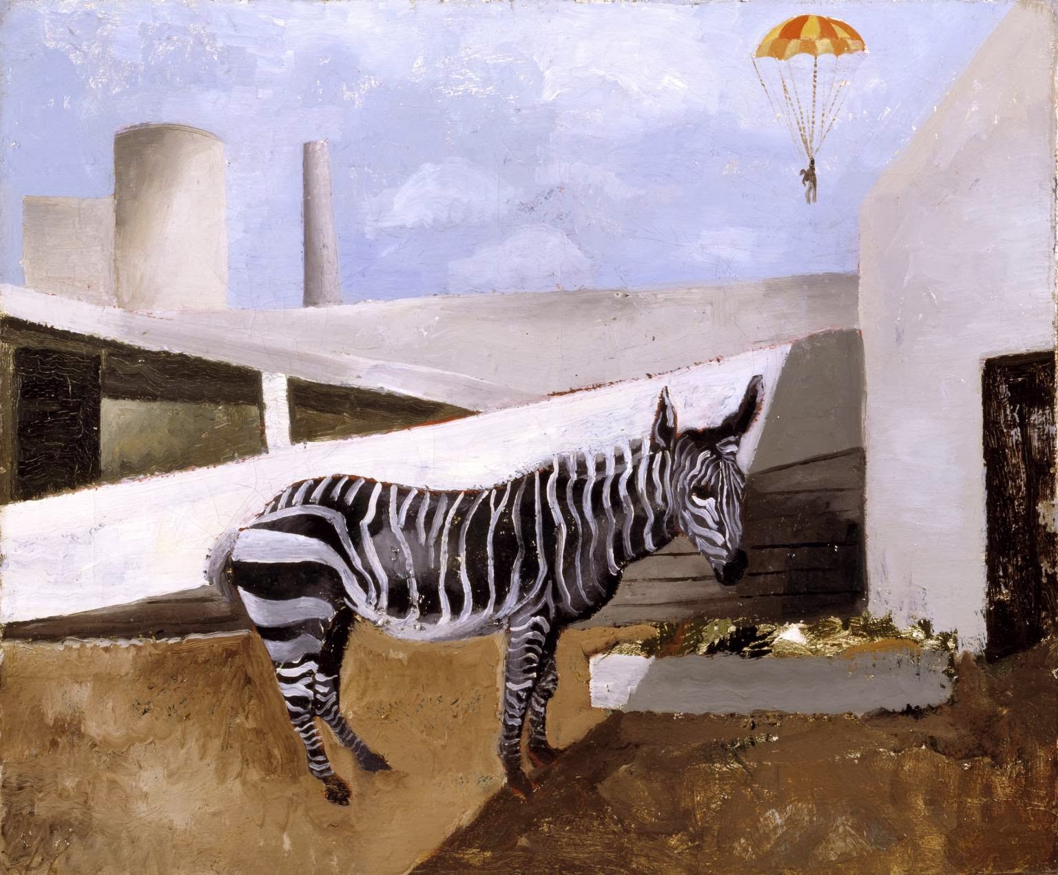
Christopher Wood's Zebra and Parachute

It does seem that out of all the artists in the exhibition, Wood was the only one who truly captured my attention. The final artwork I found captivating was his 'Zebra and Parachute' painting. It is surreal in the sense that the zebra appears to be out of context and in the background there seems to be one stuck on a parachute. The main element of this painting which initial caught my eye was the bold shapes and simplicity of the composition. This piece made me smile due to its quirkiness and total absurdity; it was nice to look at a piece of art in this way.


Leeds Art Fund 1912-2012

Joesph Mallord William Turner 1775-1851

Head of Cuckoo, Watercolour/ Graphite 1815

Further into the gallery, I found this tiny study of a cuckoo's head created by Turner. It was refreshing to see some pure talent and detail in his artwork even though the scale was small. The detail is quite amazing, especially considering it was made in watercolour which is a difficult media to use.


Munro House


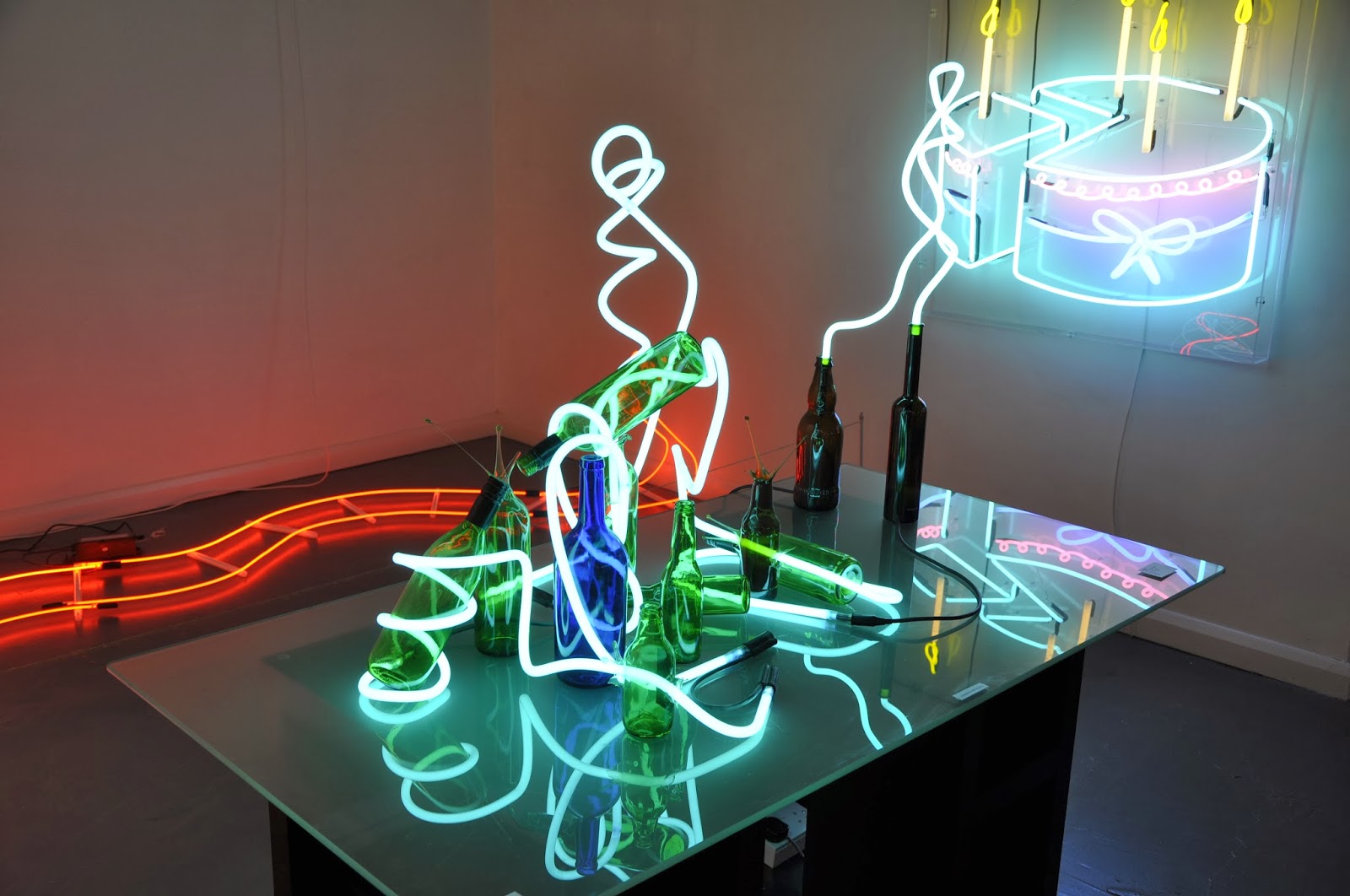
After seeing more traditional artwork at Leeds Art Gallery, Julia Bickerstaff's contemporary pop-up exhibition was appealing to the eye. She displayed a mixture of photographs, paintings and installation-type sculptures. 


Stepping Up
Home


Light Reading
Superior


In honesty, I was less impressed by Bickerstaff's neon light sculptures than her photography and paintings. There didn't seem to be any meaning behind the pieces and when I was trying to understand them I couldn't find any helpful information. Visually her pieces are aesthetically appealing but overall I found that this was all it could offer.


Graffiti in Leeds City Centre

After viewing artists work in various gallery spaces, it was great to stumble across some fantastic graffiti art in Leeds city centre. I also found some interesting placements of numbers which relate directly to my project. 


My Personal Inspirations

One of my main personal inspirations which has been consistent throughout my artistic journey has been nature and the outdoors. Thinking about my childhood, it seems that this interest began through my several camping trips I was taken on with my family. I also remember as a young child playing outdoors with other children, where one of my favourite artistic memories was creating coloured chalk drawings on the pavements (ending with my dad having to bring out the power-washer). This element of nature has stayed in my interests and work right until this present moment.

Other inspirations from the past have been books. In my teenage years I went through a phase of reading many books based on the supernatural, mainly vampires. This still interests me though not as much directly into my artwork. Political issues have also been an inspiration, for example animal cruelty and human rights. This has also carried onto now, most recently I have dealt with the issues of feminism. Moreover, I seem to have an increasing interest in superstitions.


More general inspirations at this present time include: everyday life, nature, people, happy accidents and depending on the brief given at any time, it may change.


Sunday 17 November 2013

Mid-Project Brief Thoughts

As you are aware, I have been attempting to conquer a new project brief 'The Black Mirror'. This led to basing my project around the symbolism of numbers and playing cards, which has given me a desire to create my own pack of cards.

I will admit, this has taken me in several, unconnected and often frustrating directions. Many of my ideas seem to fall flat and lead to no-where. Regardless, these have given me many platforms for the basis of ideas which could inevitably lead to successful outcomes. For now, I am trying to get as many of these ideas out of my head and onto paper (or Photoshop), which is sometimes difficult. As an illustrator, it is extremely important to me that my work is original, unique and appealing to the eye.

Therefore, I must apologise in advance if my work appears somewhat disconnected, as I am struggling to decide on which idea to take forward and develop into finished pieces of work.

My personal aims: to get past the 'artist's block stage and create successful visuals through experimenting and trial and error! More work will appear soon for sure!

Thanks for reading :)

Wednesday 13 November 2013

Further Experimentation


Dead Bird:


Created with acrylic paint, originally in black and white tones. Relations to the film 'Drowing by Numbers' first scene where dead bird hangs from a post. Significant to the themes of tragedy and death and provides more serious and mature attitude towards the topic.


Trees:


Also painted in acrylic. Totally from imagination, I aimed to focus on the tonal aspects of the trees. The simple image gives an eerie vibe when inverted in Photoshop, signifying the theme of tragedy and death.


Ace of Spades:


This acrylic painting aimed to capture the composition of a dead bird in the form of a classic Ace of Spades. This was an initial idea to go towards my playing cards, though I think these images are too rough an unfinished. Red in the right image symbolises blood and death

Dice Prints- Ace and Two of Clubs


These two images were edited in Photoshop from the original image seen in a previous post 'Dice Printing'. The first image reminds me of a butterfly perhaps, giving a more light-hearted feel to the symbolism of numbers. The second image appears more abstract and more is left open for interpretation by the viewer. As two of the clovers are included in this image, I would use this as a representation of the Two of Clubs.


Overall, these experiments are all unique and successful in their own ways. At this point I am not sure which style to develop further for my pack of cards, though I will create more imagery in both styles to see which work best.


Thursday 7 November 2013

Dice Printing

What's more obvious when thinking of a link between numbers and games? Dice! Therefore, having decided I had found an ideal link, I went and purchased a couple of dice with the intention of printing with them.

Here are some of the outcomes of my experiments with dice printing:


I really valued the initial dice prints and how they turned out. At first I wasn't sure because the numbers and spots from the dice were unclear once printed, however I began to like this effect when greater quantities of the prints were put together. Right: the number 5 created with the number 5- a quirky but fun idea.


These images made from the same printing technique are more refined. The left is an image of a clover, reflecting the 'club' suit from playing cards, whilst the image of the right is reflective of the Ace of Spades. Both are made from the number which reflects the image the most i.e. the number 4 to reflect the amount of leaves on the clover, and the number 1 to reflect the Ace.


Illustration created by layering two of the dice print images in Photoshop and altering the brightness, contrast and tones.

Overall, I think this printing technique is successful, however I feel it could be quite limiting when wanting to produce stronger, detailed imagery. This method is more suited to simple pattern or images though I could test it out on a bigger scale to see if more detail and tone could be added to make a better illustration overall.


Wednesday 6 November 2013

Personal Brief

As an extension of The Black Mirror project brief, I was set to create a new, more focused brief based on my personal project and the outcomes. This is a flexible brief and may change due to changes in development and ideas, though judging by what I have done so far here is my 'new' brief:

'Look into the main themes and concepts in the film 'Drowning by Numbers' and create a finished body of work which can be appropriately placed within the illustration industry. This could take any form of your choice and any media may be used, but it must achieve a high level of standard so that the work will be client-ready and finished/ presented in the correct context. 

The complete works should not have literal connotations to the film, though it must be evident which theme has been undertaken. Document all research, processes and ideas in appropriate formats.'


Reflective Statement: The Black Mirror

So far in the development of my project, I feel that I have challenged my abilities
to come up with new and original ideas. Though, even at this time, a lot of those
ideas seem to be going nowhere and I need to focus on one idea and develop it
further or try out several and decided which is the most effective.

From the beginning I have had a desire to contextualise my work in some form
and aim produce work with a high standard for the 'real' world. I have also
been experimenting with different forms of traditional and digital mixed media
and collage in an attempt to find the most suitable technique for the chosen
subject. This has been primarily documented in a sketchbook but also on this
blog in order to keep my thoughts and process together and keep track of
where I am in the project. 

How do I feel about progress so far?

All in all, I do honestly feel a little lost in the project, mainly due to my personal struggle with getting my ideas documented visually and perhaps not researching enough into my chosen theme to enable my ideas to flow easily.
Even so, I have some strong starting points for potentially successful ideas, but I think that a bit more research and visual direction will help me to gain a better focus.

How does my project relate to future career aspirations?

In regards to future prospects, I have tried to focus my project on producing work which may
eventually become part of a sellable product which could feature within the illustration
industry. I am also trying to test out different areas of illustration such as editorial and mass
production to see which suits my style most. My aim for the end of this project is to create
illustrations of a high standard featured and presented within their appropriate contexts.

Friday 1 November 2013

Mock Up of 48 Hour Project Brief

For a previously set project brief I decided to develop my illustration even further and mock up the double page spread for 'Sight and Sound' magazine, including my original illustration intended for the brief and an additional painting I created afterwards.

Here are links to the previous blog posts explaining the project and my visual response for anyone who has not seen them yet: '48 Hour Project Brief''48 Hour Brief: Visual Reponse'

Using InDesign, I was able to make a working visual of my illustrations within a 'real life' context, mocked up for a magazine article. I researched into the magazine I had designed for 'Sight and Sound' to enable me to assess the general 'look' and layouts which were commonly used. Without knowing specific details about fonts size or type, I tried my best to make my mock up visual fit within the true magazine as though it would be displayed as a finished article. Therefore, I used a review by Roger Ebert of 'Drowning by Numbers' so it would allow my illustrations to capture the main themes in the film.


I am quite pleased with the outcome of creating an article including my illustrations, as it gives me a better idea of how I can present and contextualise my work for the 'real world'. It makes my work look more professional and client-ready which I am increasingly aiming for throughout my second year at University.