Thursday, 7 November 2013

Dice Printing

What's more obvious when thinking of a link between numbers and games? Dice! Therefore, having decided I had found an ideal link, I went and purchased a couple of dice with the intention of printing with them.

Here are some of the outcomes of my experiments with dice printing:


I really valued the initial dice prints and how they turned out. At first I wasn't sure because the numbers and spots from the dice were unclear once printed, however I began to like this effect when greater quantities of the prints were put together. Right: the number 5 created with the number 5- a quirky but fun idea.


These images made from the same printing technique are more refined. The left is an image of a clover, reflecting the 'club' suit from playing cards, whilst the image of the right is reflective of the Ace of Spades. Both are made from the number which reflects the image the most i.e. the number 4 to reflect the amount of leaves on the clover, and the number 1 to reflect the Ace.


Illustration created by layering two of the dice print images in Photoshop and altering the brightness, contrast and tones.

Overall, I think this printing technique is successful, however I feel it could be quite limiting when wanting to produce stronger, detailed imagery. This method is more suited to simple pattern or images though I could test it out on a bigger scale to see if more detail and tone could be added to make a better illustration overall.


Wednesday, 6 November 2013

Personal Brief

As an extension of The Black Mirror project brief, I was set to create a new, more focused brief based on my personal project and the outcomes. This is a flexible brief and may change due to changes in development and ideas, though judging by what I have done so far here is my 'new' brief:

'Look into the main themes and concepts in the film 'Drowning by Numbers' and create a finished body of work which can be appropriately placed within the illustration industry. This could take any form of your choice and any media may be used, but it must achieve a high level of standard so that the work will be client-ready and finished/ presented in the correct context. 

The complete works should not have literal connotations to the film, though it must be evident which theme has been undertaken. Document all research, processes and ideas in appropriate formats.'


Reflective Statement: The Black Mirror

So far in the development of my project, I feel that I have challenged my abilities
to come up with new and original ideas. Though, even at this time, a lot of those
ideas seem to be going nowhere and I need to focus on one idea and develop it
further or try out several and decided which is the most effective.

From the beginning I have had a desire to contextualise my work in some form
and aim produce work with a high standard for the 'real' world. I have also
been experimenting with different forms of traditional and digital mixed media
and collage in an attempt to find the most suitable technique for the chosen
subject. This has been primarily documented in a sketchbook but also on this
blog in order to keep my thoughts and process together and keep track of
where I am in the project. 

How do I feel about progress so far?

All in all, I do honestly feel a little lost in the project, mainly due to my personal struggle with getting my ideas documented visually and perhaps not researching enough into my chosen theme to enable my ideas to flow easily.
Even so, I have some strong starting points for potentially successful ideas, but I think that a bit more research and visual direction will help me to gain a better focus.

How does my project relate to future career aspirations?

In regards to future prospects, I have tried to focus my project on producing work which may
eventually become part of a sellable product which could feature within the illustration
industry. I am also trying to test out different areas of illustration such as editorial and mass
production to see which suits my style most. My aim for the end of this project is to create
illustrations of a high standard featured and presented within their appropriate contexts.

Friday, 1 November 2013

Mock Up of 48 Hour Project Brief

For a previously set project brief I decided to develop my illustration even further and mock up the double page spread for 'Sight and Sound' magazine, including my original illustration intended for the brief and an additional painting I created afterwards.

Here are links to the previous blog posts explaining the project and my visual response for anyone who has not seen them yet: '48 Hour Project Brief''48 Hour Brief: Visual Reponse'

Using InDesign, I was able to make a working visual of my illustrations within a 'real life' context, mocked up for a magazine article. I researched into the magazine I had designed for 'Sight and Sound' to enable me to assess the general 'look' and layouts which were commonly used. Without knowing specific details about fonts size or type, I tried my best to make my mock up visual fit within the true magazine as though it would be displayed as a finished article. Therefore, I used a review by Roger Ebert of 'Drowning by Numbers' so it would allow my illustrations to capture the main themes in the film.


I am quite pleased with the outcome of creating an article including my illustrations, as it gives me a better idea of how I can present and contextualise my work for the 'real world'. It makes my work look more professional and client-ready which I am increasingly aiming for throughout my second year at University.


Tuesday, 29 October 2013

48 Hour Brief: Visual Response

To begin with, I started writing down and visualising ideas based on the second drowning scene in 'Drowning by Numbers' focusing on the ice lolly melting in the grass.


 Left: The melting ice lolly in the scene reflects on the slow drowning death of Cissy's husband. The film cuts to the ice lolly twice during the death, finally melting when her husband is dead. I loved the concept behind this and how it was a subtle representation of such a dramatic scene.


Initial thoughts for themes which could relate to my editorial illustration were; the hint of red on Cissy's beret which is a key feature of her character, lies, deceit, sexual dissatisfaction, and obviously the idea of death and deterioration.


From this I created a few visual responses to get my ideas flowing. These are extremely rough but portray my thought process when deciding on a final outcome.


After my initial thoughts I then decided to feature the ice lolly in my illustration as a main reflection of the scene. This included two ice lollies next to each other in composition (as seen top right), with one whole and the other melted almost completely. This was intended to convey Cissy as a dominant figure (left ice lolly) which over-powered, and eventually killed, her husband by drowning. I deliberately used watercolour for this to gain the textured effect of a real ice lolly, and also it made it possible to use the wet-in-wet technique to enable me to portray the melting effect of the lolly. Red tones were also used to imitate danger and blood, but also the significant red beret Cissy's character wears throughout the film.

My final process of creating my editorial illustration was experimenting with digitalising one of the images in Photoshop.


Altering the brightness and contrast of the image immediately made it look and feel more complete. I also saturated the tone slightly as I felt the image was too bright for the Sight and Sound magazine I was illustrating for, who generally use more muted tones.


As a complete editorial illustration I didn't feel like the image was complete at all. Therefore, I took a collage I had previously done and experimented with layering and altering the opacity in Photoshop. This gave the illustration a more complete composition for the double page spread layout.

Finally, after altering various aspects of the layered image, I came to a visual standard which I feel is appropriate for the magazine I was designing for.
Final editorial image

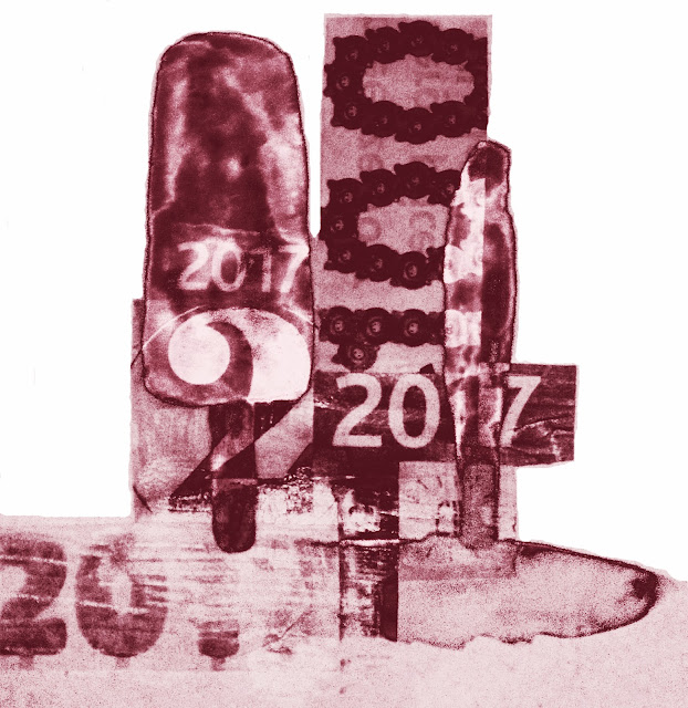
The final outcome, I feel, is very effective for communicating the key themes from the chosen scene in 'Drowning by Numbers' and captures an appropriate style to fit the brief for the Sight and Sound Magazine. I chose just one muted burgundy tone in the final image as it represents the themes of death in the scene. The background collage adds an element of numbers into the illustration which bring more of a clear link to the film. I also value how the initial ice lolly illustration appears fully incorporated into the final visual image, and fits into the composition very effectively. The editorial illustration as a whole is not literal at all, and makes the viewer think about the ideas and representations in the film.

Overall, I am pleased with the final outcome of this project and feel that working quickly is a positive way of working as it forces me to concentrate on my ideas and visual process without over-thinking too much. As well as this, through making this illustration quickly, it has opened up a new style of working for me which I will consider continuing into my main Black Mirror project.


48 Hour Project Brief!

So today I was kindly informed by lecturer Ian Massey, that there is a new project brief set... with a deadline for TWO days time! At first this slightly worried me, though after speaking about it I realised this would be perfect experience and practice for real illustration client briefs I could possibly be set in future. Therefore, I am very excited about this quick project as it will test my abilities as an aspiring illustrator and challenge the speed in which I work.

Here is the project brief which was set:

• You have until 2.15pm on Thursday  to produce a good working visual of an illustration for the magazine Sight and Sound. Your visuals will then be presented to the Art Directors of the magazine (aka Dr Lisa Stansbie and Dr Ian Massey), who will with other students provide feedback on the work you have undertaken.

• Your illustration is to accompany a one-page feature article about the film you are working with as the subject matter for the current project. The illustration will form part of a double-page spread, and will fill a whole page of the magazine.

• The illustration should encapsulate the key themes of the film, or concentrate on a key scene which is central to the film narrative. It must be in portrait format, and in colour, though the amount of colour utilised is up to you. You may use any technique you feel relevant.

• The magazine is published by the British Film Institute and as a wide and informed readership. You illustration should be pitched at the magazine readership.

As a starting point I decided it would be best to find out more about the magazine, Sight and Sound, published by the BFI to give me a better idea of their own personal style and content. 


After viewing the 2013 issue of Sight and Sound I found the general look of the magazine to be quite clean and ordered. There also seems to be a colour scheme of muted tones which fit the overall professional look of the magazine. Above, the imagery contains dark tones to imitate the horror theme of the issue. There is a clear target audience of adults for this magazine, so when creating my editorial illustration I will take into account the style of the magazine and common themes.

For my personal editorial illustration, I will take inspiration from the film I have been working with, 'Drowning by Numbers'. As I have already been looking into some of the key themes and scenes for my main project, it seems appropriate to work with what I already know. Therefore, my editorial illustration will focus on one of these elements whilst taking into account the predominant style of the magazine.

More to come soon!!


Wednesday, 23 October 2013

Illustration Weekly Briefing 22.10.13

Lecturer: Ian Massey

In this weeks illustration weekly briefing, the focus was on Illustration and Text: the integration of image and words.

Sara Fanelli

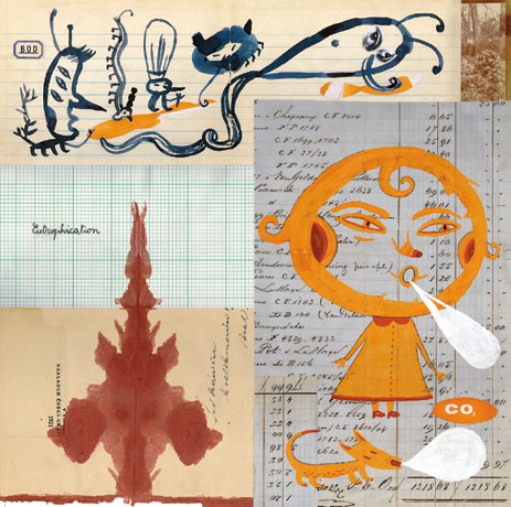
I was particularly inspired by one artist which was given as an example, Sara Fanelli, whose work I have viewed before. Her main techniques include collage with old, decorative paper which often incorporates text.

Magazine Illustration
I love Fanelli's use of mixed media to create interesting, unique imagery. This gave the idea to use collage in my own work, perhaps using text and numbers to relate to my own project involving association with numbers. On the other hand, as I wish to create a pack of playing cards, I could use numbers written as words to include a text element in my work.


Oliver Jeffers

Jeffers' editorial design and sketchbook work also intrigued me with the element of humour and quirky illustrations.

 – Economic Indicators
 – Mexico City

I noticed that in both Jeffers' and Fanelli's work, the text element has always got a sense that is has been handwritten. This makes their work more authentic and original, giving a sense of personal style. The imagery and text work together in an informal manner, never seeming to be too neat and careful. This gives the artists work a more individual quality and made me realise that illustration doesn't need to be completely perfect to be successful. 

Later on I explored the idea of text and illustration through contextualising an illustration by placing it within a magazine article with text along side it. I feel that this kind of integrating text gives the illustration a sense of purpose, where an individual illustration might struggle to offer without this element. I used InDeisgn to create this finished visual which can be seen on another blog post 'Mock Up of 48 Hour Brief'. Take a look.