Showing posts with label ink. Show all posts

Thursday, 7 May 2015

Developing Final Illustrations

When developing my illustrations, I take into consideration the compositions of my pieces. The page needs to be filled out effectively without making the content too busy. These first two images are on A4 sheets of watercolour, however when I had my formative assessment and through tutorials, I have been encouraged to work on a larger scale. This has faced me with a challenge as I have been taken out of my comfort zone, but I believe it has work out well.


Below, these pieces are all on A2 sheets of watercolour paper. Scaling my work up has allowed me to explore the composition more and experiment with bolder strokes and washes of colour, As a whole, a larger scale has more impact and creates stronger illustration. The scale also reflects the greatest of the animals and their physical size. They are important to the wild and through up-scaling my work this is portrayed more effectively.


Above, I have incorporated elements of the issues faced by the animals in the wild. The Asian elephants main crisis is the threat of habitat loss through deforestation. This has been applied to my illustration through the great expanse in the composition. The elephant is more defined in order to bring it to the foreground of the image whilst the tones become lighter in the right half of the composition to create a sense of distance. The light space really enhances the idea of space and distance as the elephant looks out into the background wondering where his home has vanished to.

In the illustration of the orang-utan I have included symbols with an aim to be thought-provoking for the viewer. This could be interpreted in numerous ways by the viewer although a main sense of human-wildlife conflict is apparent. My intention was to reflect the illegal pet trade which orang-utans are often succumbed from the wild. In this illustration the dark tones of the ink reflect the human conflict towards the animal. The hand is grabbing the orang-utan and the chains are a symbol of being trapped and controlled. This illustration is particularly strong for depicting the threats to the species by humans directly. The subtle orange tones used for the fur create a sense of vulnerability and also define the animal as it's specific species, an orang-utan. 


Saturday, 25 April 2015

Experimenting with Drawing on Frames

After producing some A4 watercolour and ink animal portraits, I felt they needed an element of imagery which reflected the issue faced by each species. Therefore, not wanting to spoil the original imagery, I directly drew onto the glass in permanent marker. The left illustration reflects deforestation with the stumps of trees and the right illustration reflects the illegal pet trade of orang-utans with the bars. Scratching into the thick lines gives the impression of depth for the bars and also adds texture. 


Even though these are quite effective for creating a statement about the issues, the harshness of the black draws attention away from the illustrations and the subtly of watercolour is subdued. 

To make the illustrations more prominent and the focal point in the exhibition, white frames could be used, clear with the original illustrations. This will highlight the illustrations and raw texture in the pieces without distracting from the sensitive content.

Thursday, 17 October 2013

Experimenting with Playing Card Ideas

To get some of my initial thoughts flowing, I began by creating some quick watercolour and ink thumbnails of potential playing card designs. 


Above: Original designs manipulated in Photoshop.


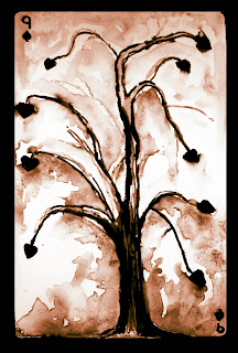
Left: This design for the 9 of Spades was inspired by a deeper meaning than the others. It is based on one of the final scenes in 'Drowning by Numbers' where Smut, a boy who plays the role of game maker throughout the film, commits suicide by hanging himself from a tree. 

In the illustration I have included the tree as a more literal connotation of the boy's death, whilst the spades act as leaves. I chose 9 spades as, through research, I found that this specific number has symbolism relating to loss which is ideal for the portrayal of the tragic scene.


Below: As I thought my original design was too brightly coloured for the subject matter, I altered the tones and contrast in Photoshop to create these more subtle images.


Overall, I think that my designs are a good starting point for further development of my work. However, whilst I like how they come across quite playful, I would like to create designs which reflect upon the film's theme of tragedy so I need to create imagery more suitable whilst still keeping the association with numbers.