Showing posts with label ian massey. Show all posts

Thursday, 5 December 2013

Alan Driscoll's Fascinating Deck of Cards


For my final body of work I have decided to produce unique designs based on my project and the themes in 'Drowning by Numbers' to create a pack of playing cards. Having figured out about half of the designs, I came to a mental block and found myself struggling to think of the rest of the designs. Therefore, I spoke to my tutor Ian Massey who gave me a link to a fantastic set of playing cards where 56 contemporary artists/ designers collaborated to make individual card designs. Included, there was a description of the cards:

THE DECK OF CARDS
Fifty-six contemporary British artists have been especially commissioned to contribute to this unique interpretation of a pack of playing cards. Each cards represents the original work of a different artist, together with additional designs for the reverse and for the box. The cards have been printed on Superluxe board and have been produced in the traditional Old English size.
Although some of the artists are better knon than others, all have examples of their work in public collections in Britain or aborad. A list of the contributors involved and details of where their work can be seen in presented below. Numbers alongside each collection relate to the numbered alphabetical list of artists' names that follows.
From the abstract to the surrealist to the representative, this deck represents a fairly wide variety of modern art forms, media and technique. In the works depicted in this deck you'll find portraiture, pure color studies, primitive work almost cartoonish in its aesthetic, even photography, retouched and pure, and more. Most every modern school can be found here. And there is no lack of visual puns. Each of the artists represented here took their own particular inspiration from the card they were given in a strange and unique direction. No two paintings are more than superficially alike, and they are worth studying together as much as they are worth studying separately. In their similarities you can find the soul of playing cards, and in their differences you can find the soul of the artists.The box design is by Tim Whitmore, the back design is by Kenneth Martin, and the joker is by either Anthony Green or Anthony Donaldson (it's not clear from the documentation).


Here are some examples of the cards:


Some of the artists involved in this project are:

Artists include:
David HOCKNEY
John HOYLAND
Maggie HAMBLING
Patrick HERON
Howard HODGKIN
Patricki CAULFIELD
Sandra BLOW
Terry FROST
Philip SUTTON
Allen JONES

Having seen the variations in the designs, it has given me more confidence in my own designs. Initially I was worried about my designs being too simple, but having seen the success in the simplicity of these creations I feel that sometimes simple can work better than complex artwork. From looking at this pack of playing cards, I feel that I can provide a wider variety of work in my own designs without worrying if they all link together stylistically and visually. 


Thursday, 28 November 2013

Inspiration Project Brief

Last week I was set a short project brief based on inspirations. After expressing what inspires me on a personal level on my previous blog post 'My Personal Inspirations' and sharing my thoughts with the rest of my peers at University, we were set a challenge in randomised pairs to create an illustration based on the other persons own inspirations.

I was paired up with Katie Mcternan who's personal work can be found on her blog at: http://katiemcternanillustration.tumblr.com/

Katie's Inspirations:

Nature- Andy Goldsworthy, man made vs nature (destruction of nature)- Julian Schnabel, patterns - Yellena James and Beatriz Milhazes, texture, butterflies - colour and pattern - Damien Hirst, Fiona Rae, visiting galleries, collect objects and images of things I like to make mood/inspiration boards, taking photos of things I see and like, time- decay- watching things age, experimentation with materials, life drawing, drawing.

Interestingly, I found many similarities with my own personal inspirations. Therefore, I naturally focused on these things and decided that to create my illustrative interpretation I would use the themes of nature and decaying over time. I also looked at the artists which were given and actually really loved the work of Yellena James who uses plenty of colour and pattern in her illustrations in a subtle and delicate way.

After researching and thinking about potential ideas for my illustration, I came up with an initial sketch:


The idea behind this was to illustrate how trees lose their leaves throughout the seasons. I visualised this as a form of decay and thought it linked quite well with Katie's inspirations. Furthermore, the bird signifies the beauty of nature and I thought that a bird would be a perfect icon for representation to reflect this. 

I then went on to develop this further with watercolour as my choice of media to reflect on the subtle beauty of nature.

Original watercolour illustration

Digitalised version of original illustration. Applied manipulation of brightness/ contrast, hue and saturation.


Final version of digital illustration


I believe that the final illustration I created was successful in the sense it portrays a sense of time and decay in a simple manner. The dark space gives the composition a sense of space, but also reflects the negativity of the theme of decay. The birds are almost 'dancing' in the air which gives a sense of juxtaposition and calm when the surroundings and themselves appear to be deteriorating.

Once digitalised, I feel it has enhanced my original illustration and made it stronger. It is not giving too much away and allows the viewer to interpret the illustration in their own way.

Cropping the image right makes the birds iconic without needing the rest of the image to understand the theme of decay within nature.


Reflection on Project

Overall I have found this project has given me a sense of relief from the main 'The Black Mirror' project. Forcing me to work at a fast pace has actually been a huge benefit to my approach to creating illustration, allowing me to illustrate my ideas visually without over-thinking or questioning them. As a matter of fact I believe through the creation of this illustration I can move forward with my main project and produce more visuals for my final outcomes.


Katie's Illustration based on my own Inspirations

As I was paired up with Katie for this brief, she also created an illustration based on my own personal inspirations (which can be seen on a previous post 'My Personal Inspirations').


After seeing Katie's illustration it immediately struck me how similar our compositions appeared to be, and how we both picked out the nature elements of our inspirations. We both also used watercolour as our choice of media which was interesting and demonstrated how similar our inspirations actually are. I think Katie has done a great job of depicting my personal inspirations, and how she chose to illustrate my childhood within quite a maturely painted and subtle background.


Monday, 25 November 2013

My Personal Inspirations

One of my main personal inspirations which has been consistent throughout my artistic journey has been nature and the outdoors. Thinking about my childhood, it seems that this interest began through my several camping trips I was taken on with my family. I also remember as a young child playing outdoors with other children, where one of my favourite artistic memories was creating coloured chalk drawings on the pavements (ending with my dad having to bring out the power-washer). This element of nature has stayed in my interests and work right until this present moment.

Other inspirations from the past have been books. In my teenage years I went through a phase of reading many books based on the supernatural, mainly vampires. This still interests me though not as much directly into my artwork. Political issues have also been an inspiration, for example animal cruelty and human rights. This has also carried onto now, most recently I have dealt with the issues of feminism. Moreover, I seem to have an increasing interest in superstitions.


More general inspirations at this present time include: everyday life, nature, people, happy accidents and depending on the brief given at any time, it may change.


Friday, 1 November 2013

Mock Up of 48 Hour Project Brief

For a previously set project brief I decided to develop my illustration even further and mock up the double page spread for 'Sight and Sound' magazine, including my original illustration intended for the brief and an additional painting I created afterwards.

Here are links to the previous blog posts explaining the project and my visual response for anyone who has not seen them yet: '48 Hour Project Brief''48 Hour Brief: Visual Reponse'

Using InDesign, I was able to make a working visual of my illustrations within a 'real life' context, mocked up for a magazine article. I researched into the magazine I had designed for 'Sight and Sound' to enable me to assess the general 'look' and layouts which were commonly used. Without knowing specific details about fonts size or type, I tried my best to make my mock up visual fit within the true magazine as though it would be displayed as a finished article. Therefore, I used a review by Roger Ebert of 'Drowning by Numbers' so it would allow my illustrations to capture the main themes in the film.


I am quite pleased with the outcome of creating an article including my illustrations, as it gives me a better idea of how I can present and contextualise my work for the 'real world'. It makes my work look more professional and client-ready which I am increasingly aiming for throughout my second year at University.


Tuesday, 29 October 2013

48 Hour Brief: Visual Response

To begin with, I started writing down and visualising ideas based on the second drowning scene in 'Drowning by Numbers' focusing on the ice lolly melting in the grass.


 Left: The melting ice lolly in the scene reflects on the slow drowning death of Cissy's husband. The film cuts to the ice lolly twice during the death, finally melting when her husband is dead. I loved the concept behind this and how it was a subtle representation of such a dramatic scene.


Initial thoughts for themes which could relate to my editorial illustration were; the hint of red on Cissy's beret which is a key feature of her character, lies, deceit, sexual dissatisfaction, and obviously the idea of death and deterioration.


From this I created a few visual responses to get my ideas flowing. These are extremely rough but portray my thought process when deciding on a final outcome.


After my initial thoughts I then decided to feature the ice lolly in my illustration as a main reflection of the scene. This included two ice lollies next to each other in composition (as seen top right), with one whole and the other melted almost completely. This was intended to convey Cissy as a dominant figure (left ice lolly) which over-powered, and eventually killed, her husband by drowning. I deliberately used watercolour for this to gain the textured effect of a real ice lolly, and also it made it possible to use the wet-in-wet technique to enable me to portray the melting effect of the lolly. Red tones were also used to imitate danger and blood, but also the significant red beret Cissy's character wears throughout the film.

My final process of creating my editorial illustration was experimenting with digitalising one of the images in Photoshop.


Altering the brightness and contrast of the image immediately made it look and feel more complete. I also saturated the tone slightly as I felt the image was too bright for the Sight and Sound magazine I was illustrating for, who generally use more muted tones.


As a complete editorial illustration I didn't feel like the image was complete at all. Therefore, I took a collage I had previously done and experimented with layering and altering the opacity in Photoshop. This gave the illustration a more complete composition for the double page spread layout.

Finally, after altering various aspects of the layered image, I came to a visual standard which I feel is appropriate for the magazine I was designing for.
Final editorial image

The final outcome, I feel, is very effective for communicating the key themes from the chosen scene in 'Drowning by Numbers' and captures an appropriate style to fit the brief for the Sight and Sound Magazine. I chose just one muted burgundy tone in the final image as it represents the themes of death in the scene. The background collage adds an element of numbers into the illustration which bring more of a clear link to the film. I also value how the initial ice lolly illustration appears fully incorporated into the final visual image, and fits into the composition very effectively. The editorial illustration as a whole is not literal at all, and makes the viewer think about the ideas and representations in the film.

Overall, I am pleased with the final outcome of this project and feel that working quickly is a positive way of working as it forces me to concentrate on my ideas and visual process without over-thinking too much. As well as this, through making this illustration quickly, it has opened up a new style of working for me which I will consider continuing into my main Black Mirror project.


48 Hour Project Brief!

So today I was kindly informed by lecturer Ian Massey, that there is a new project brief set... with a deadline for TWO days time! At first this slightly worried me, though after speaking about it I realised this would be perfect experience and practice for real illustration client briefs I could possibly be set in future. Therefore, I am very excited about this quick project as it will test my abilities as an aspiring illustrator and challenge the speed in which I work.

Here is the project brief which was set:

• You have until 2.15pm on Thursday  to produce a good working visual of an illustration for the magazine Sight and Sound. Your visuals will then be presented to the Art Directors of the magazine (aka Dr Lisa Stansbie and Dr Ian Massey), who will with other students provide feedback on the work you have undertaken.

• Your illustration is to accompany a one-page feature article about the film you are working with as the subject matter for the current project. The illustration will form part of a double-page spread, and will fill a whole page of the magazine.

• The illustration should encapsulate the key themes of the film, or concentrate on a key scene which is central to the film narrative. It must be in portrait format, and in colour, though the amount of colour utilised is up to you. You may use any technique you feel relevant.

• The magazine is published by the British Film Institute and as a wide and informed readership. You illustration should be pitched at the magazine readership.

As a starting point I decided it would be best to find out more about the magazine, Sight and Sound, published by the BFI to give me a better idea of their own personal style and content. 


After viewing the 2013 issue of Sight and Sound I found the general look of the magazine to be quite clean and ordered. There also seems to be a colour scheme of muted tones which fit the overall professional look of the magazine. Above, the imagery contains dark tones to imitate the horror theme of the issue. There is a clear target audience of adults for this magazine, so when creating my editorial illustration I will take into account the style of the magazine and common themes.

For my personal editorial illustration, I will take inspiration from the film I have been working with, 'Drowning by Numbers'. As I have already been looking into some of the key themes and scenes for my main project, it seems appropriate to work with what I already know. Therefore, my editorial illustration will focus on one of these elements whilst taking into account the predominant style of the magazine.

More to come soon!!


Wednesday, 23 October 2013

Illustration Weekly Briefing 22.10.13

Lecturer: Ian Massey

In this weeks illustration weekly briefing, the focus was on Illustration and Text: the integration of image and words.

Sara Fanelli

I was particularly inspired by one artist which was given as an example, Sara Fanelli, whose work I have viewed before. Her main techniques include collage with old, decorative paper which often incorporates text.

Magazine Illustration
I love Fanelli's use of mixed media to create interesting, unique imagery. This gave the idea to use collage in my own work, perhaps using text and numbers to relate to my own project involving association with numbers. On the other hand, as I wish to create a pack of playing cards, I could use numbers written as words to include a text element in my work.


Oliver Jeffers

Jeffers' editorial design and sketchbook work also intrigued me with the element of humour and quirky illustrations.

 – Economic Indicators
 – Mexico City

I noticed that in both Jeffers' and Fanelli's work, the text element has always got a sense that is has been handwritten. This makes their work more authentic and original, giving a sense of personal style. The imagery and text work together in an informal manner, never seeming to be too neat and careful. This gives the artists work a more individual quality and made me realise that illustration doesn't need to be completely perfect to be successful. 

Later on I explored the idea of text and illustration through contextualising an illustration by placing it within a magazine article with text along side it. I feel that this kind of integrating text gives the illustration a sense of purpose, where an individual illustration might struggle to offer without this element. I used InDeisgn to create this finished visual which can be seen on another blog post 'Mock Up of 48 Hour Brief'. Take a look.


Tuesday, 15 October 2013

Illustration Weekly Briefing 15.10.13

Lecturer: Ian Massey

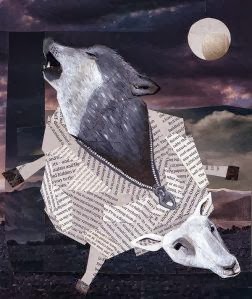
The focus of this weeks lecture was on contemporary illustration. Therefore, our task was to bring in an example of an illustration I found interesting and write a paragraph about it. The image I chose was 'A Wolf in Sheep's Clothing' by Jonathan Woodward, found from the 'Big Book of Contemporary Illustration' by Martin Dawber (2009).

Jonathan Woodward, A Wolf in Sheep's Clothing (2008)

This image caught my eye with Woodward's use of mixed media collage, including photography, text and acrylic paint. I particularly value how Woodward has chosen specific tones and images for his collage background as it sets a night time, calm mood. The text which has been used for the sheep's body is quite clever as it indicates the detailed fur strands.

The overall look of the illustration is not perfected, though finished. This suits the style of the artist and makes a unique piece of work. After seeing this, it has inspired me to perhaps include some collage into my own work including numbers.

Thursday, 10 October 2013

Illustration Tutorial 10.10.13

Group tutorial with Ian Massey.

In my first tutorial I presented my initial primary source photographs and expressed my initial idea to create my own narratives from the numbers I found in the environment. Also, i could use the idea of association to help me look at new ways of interpreting numbers to aid me in making new illustrations with various narratives .

I gained positive feedback and suggestions from my peers. One idea was to perhaps look at historical sites which contain numbers and create illustrations based on the true story behind the dates and names. Another was use numbers as information and out of context to create new narratives.

After the tutorial I felt more positive about continuing in the direction I was heading. My person target is to continue taking primary source photography of numbers in the surroundings and look into number association to see what imagery I can create.