Saturday, 27 July 2013

Progression Report: Late Night Tipple Extended Cut

For those who may have seen my earlier post Late Night Tipple I have managed to finally add some colour and shading to the Bull outline! :)

For those who have not seen my previous post, this is my Bull coloured in using Photoshop :)

I would also like to note that all my drawings/ designs/ characters which I post as digital on my blog, I do draw freehand in the beginning then draw over the original sketch using the pen tool in Photoshop.

Here it is... I hope you like it.


Feedback and tips are always welcome :)


For those interested in part of the process, here is my original sketch and the digital outline.


Don't forget to LIKE and SHARE my Facebook page as well as my Blog :) the more support I get the more work I will produce!

Facebook Page: https://www.facebook.com/CarlaTaylorIllustration


Experimenting with Blending in Photoshop


After seeing a 'how to' video on blending images in Photoshop which was shared by +joe k, I got quite excited and couldn't believe I'd never tried this before!

YouTube Link: https://www.youtube.com/watch?v=Qi_3H1iXD_Y

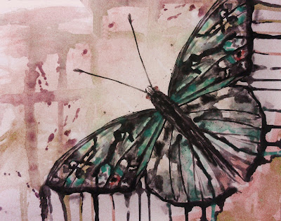
So, as you guessed, I had to try it for myself! Here is the outcome with two of my own images which were traditionally drawn/ watercolor, manipulated in Photoshop, and then merged with this really handy technique :)


Original watercolour painting drawn
with masking tape


Original mixed media butterfly


Final Image


I think this technique has worked well as the blending is very subtle yet the images are still bold and strong in colour. The hue of the leaf was changed in order to match the colour scheme used for the butterfly image. 

Overall: success. This technique will be used in future for sure!


You can now LIKE my new page on FACEBOOK :) https://www.facebook.com/CarlaTaylorIllustration

Thursday, 25 July 2013

What does it ACTUALLY take?

Sat here thinking about becoming an illustrator in future, and thinking about this blog and whether I'm truly connecting with my viewers, I decided to share with you my thoughts to break up the imagery and change it up, and perhaps allow you all to get to know my personality a tad more :)

So here goes nothing.. 


My main concerns are really how MUCH does it take to become a successful illustrator/ artist. Is it a simple case which seems to be at the heart of most successes- being WHO you know and not WHAT you know (or as I should say what I create).

Is networking the key? Or will good artwork see me through.


What do I desire from a world of success?

All in all, I want people, like yourselves, to see and support my work and for others to recognise my work as my own. The creative industry is a tough nut to crack but I believe with enough drive and ambition anyone, even me :), will crack it!


What are YOUR thoughts on making it in the art world?


WHAT DOES IT ACTUALLY TAKE?


Wednesday, 24 July 2013

Late Night Tipple

Outline of Bull created in Photoshop. Part of a bigger picture which will soon appear so watch this space!


You can see what I have been working on tonight on my Facebook page also :) https://www.facebook.com/photo.php?fbid=146860972180168&set=a.142743085925290.1073741828.142726525926946&type=1&theater

Illustration Friday: Robot

Here is my interpretation of the theme 'Robot' for this weeks Illustration Friday theme.

http://illustrationfriday.com/


The idea for this image came from circuit boards, and how the constructive layout creates interesting pattern.Sketched out and placed over an original photography, the additional circuits give a sense of eeriness and robotics as the viewer is unsure of if this creature is human or part robot. 

Manipulated in Photoshop


Above: Original sketch and manipulated sketch in Photoshop before layered over photograph.


Please like and share my Facebook page  https://www.facebook.com/CarlaTaylorIllustration

Tuesday, 23 July 2013

Love Each Day

After a sunny week in the UK I haven't had the chance to create new work. However, I make my return after thunderstorms force me inside (and inspire my creativity).

My first attempt at a little font design I did in Photoshop. The quote says 'Love Each Day';  this is a quote which a friend wanted me to design for. Here's my process, enjoy :)


A variety of designs developed from the original typography. The shadowing is created by a duplicated layer with decreased opacity and slight movement underneath. Meanwhile I experimented with colour to make the text more playful whilst the black and white makes the designs seem more serious.

My favourite has to be the pink one, it brings out my girly side :)

Sunday, 14 July 2013

Life's a Beach

Today of all days proved that great artists and their work can be found anywhere and especially when you least expect it!

My walk on Bridlington seafront caused me to encounter a small local open exhibition, free of charge, how could I resist?! When viewing the artwork I was amazed in particular by the work of Katherine McDermid who created intricately detailed works in mixed media. Her distinct style caught my eye immediately, especially a cheeky comical-faced lady balancing a stack of cupcakes in her hands definitely put a smile on my face. It gives me great pleasure to be able to show you this piece and one other that intrigued me, given permission to show you all by the artist herself!

(sorry about the reflection it was a very sunny day!)

Stacked seagulls 1
Mixed media
Katherine McDermid

Stacked cupcakes 2
Mixed media
Katherine McDermid


Talking with the artist 

I felt particularly lucky when I found these works of art as the artist herself was present! This gave me an opportunity to find more about McDermid as an artist and it had also become apparent we both had been to see the Martin Creed exhibition! (See previous post http://carlataylorillustration.blogspot.co.uk/2013/07/a-gallery-visit-martin-creed-or-crude.html)

First of all we talked about the artist's works and what type of media she used. I was even more impressed when I gained the knowledge that these pieces were created entirely from her head! Pen and ink were the primary bases of her pieces, with watercolour and finished with coloured pencils. McDermid's level of professionalism stood out for me here as from afar her works could easily be mistaken for digital. I had found out that this mistake had occurred previously which she then went on to amusingly explain how she has a lack of computer skills! 

McDermid also expressed how she had a 'down' moment in her art career where she was struggling for buyers (hard to believe!) and actually sent several of her old pieces to the tip! As a budding illustrator myself I could empathise with her on a certain level but was glad to see she had recovered her self belief as an artist and still creates beautiful pieces today!


Inspirations

It was interesting to find out some of the inspiration McDermid uses in her work to create her unique style. One of her main inspirations resides from everyday life and observing her surroundings. Often her work is based on true life and overhearing conversations between strangers. This idea of her work being spontaneous and forming from completely random events is very intriguing as the subject of the artwork is not determined by the artist herself, but the conversations she hears at the time. 


Overall, I was so pleased to have discovered an extremely talented LOCAL artist with current and modern work. As a person, McDermid was very pleasant to speak to and happily shared her past and current experiences as an artist. To see an artists work and to engage with an artist them-self can completely change one's perception of a particular piece or series. For me, this made me appreciate the work even more knowing that such a nice person had created them!

I would definitely recommend  having a look at Katherine McDermid's creations to all art and non-art lovers out there!


More of her work and history as an artist can be found on her website http://katherinemcdermid.com/index.htm Go check it out!


Wednesday, 10 July 2013

Two for Joy!


So I created a little illustration a while back and thought that now I'm finally acquiring some decent Photoshop skills I would digitalise it! Here is my process of how I made a simple sketch into something more finished.

The illustration is an abstraction of two Magpies in flight. These link to the superstition of 'One for Sorrow' which the second line reads 'Two for joy'


Any feedback appreciated and more can be found on my new Facebook page at https://www.facebook.com/CarlaTaylorIllustration

Enjoy :)
Digitalised sketch. Outlined in Photoshop


Trying out colour over outlines


Inverted colour


Full colour complete with subtle shading


For the last image I took away the lighter blue line which left my original shading I layered over the top. This has actually turned out successful as the colour is more subtle but still apparent.This is more suited to my softer style of work. 

However, I am unsure which of the last two images I prefer! Perhaps you all can help me decide :) 


What did everyone think of the inverted concept? At first I loved it! Then I loved the softer colour on the white background. 

Currently trying out different versions of colour in this illustration so keep your eyes peeled for more!


Tuesday, 9 July 2013

Illustration Friday: Protest

So I decided to get more involved in the art world, so entered my own digital illustration based on the theme of PROTEST on Illustration Friday.  

This was an original sketch illustrating the vulnerability women face concerning domestic violence, rape and any other women-related abuse. The girl is portrayed in a closed of position to signify her physical torment and fear. 

In relation to the theme of 'Protest', rather than directly illustrating someone/ something in the act of protest, I wanted the viewer to protest within oneself and make their own decision on which kind of protest should be taken forward. 


Monday, 8 July 2013

Character Design: Owl

Following on from my last character design, I decided to make another!


Original sketch of cute owl


Outline completed to create digital image


Coloured on white background


Final image on black background.

Saturday, 6 July 2013

A Gallery Visit: Martin Creed or Crude?


Visit: July 2013


Ferens Art Gallery, Hull

ARTIST ROOMS on tour, Martin Creed  

8 June - 6 October 2013
(photos were not allowed so I tried my best describing!)


So my initial reaction when I walked into the gallery space was that it was clearly contemporary, minimalist art. At this point I was thankful for my years studying all aspects of the art world, so felt prepared for what I was about to experience.


Creed's first piece I came across I actually found interesting, as he had used every paint brush from a packet on each canvas in an almost pyramid type form. Though visually minimal, this piece signified equality and representation, a desire to include every brush which could have been used so not to give importance to a single colour or brush type (I guess).

Unfortunately I was not prepared for the sickening disruption which took me by surprise when viewing the first piece of Creed's work; the sound of vomiting.

As soon as I put an image to the sound, I realised that not one, but FOUR people on multiple screens were sequentially and repeatedly vomiting in white cubed spaces. I guess the only thing separating this vile action from art and non - art was the white walled 'gallery' space each individual vomitted in. Is this Art? Myself? I'm not so sure. Though if art is supposed to trigger a reaction from the viewer, it certainly did that! After reading more on the videos (whilst trying not to cringe as the sounds in the background) I found out that Creed had also made videos of people defecating. I'm almost ashamed to say curiosity got the better of me and I definitely would not recommend viewing this at all! Unless you are a bit more open minded than I am.

As expected before I wrote this post, most of it has been about my negative experience whilst viewing Creed's exhibition. However, I still took time to look at his other pieces and was particularly taken by his 'Work No. 890 Don't Worry, 2008, Yellow Neon.' As suggested by the title, this piece featured a vibrant yellow neon sign spread over a corner of the gallery, spelling out the words 'Don't Worry'. This piece was very striking, and after reading about it I understood that this phrase challenged the viewer's perspective and worry about not understanding art. This is very true when looking at Creed's work as some may call it conceptual, but the artist likes to call himself an expressionist as he believes that all his work conveys feelings and it is impossible to just portray ideas without emotion.

Overall, I have mixed feelings about my experience at Martin Creed's pop-up exhibition. His artwork is extremely controversial and not for the feint-hearted! Even so, his work does challenge how people view art, and how it perhaps should be viewed in today's society. I'm afraid to say even artists of my kind can not yet be fully opened minded when images so crude are presented in the public eye. Personally I value art as a joyful experience.

I just wish I'd seen the warning signs before I entered the exhibition!


A question to ask yourself- 

But is it art?


Review by Carla Taylor


If you want to view his work, you can do so online at http://martincreed.com/site/works


Thursday, 4 July 2013

It Is Not Only Fine Feathers That Make Fine Birds

Here is the complete illustration I created for one of my personal favourite Aesop fables 'The Jay and the Peacock'.

Link:   The Jay and the Peacock

I took the moral 'it is not only fine feathers that make fine birds' in an illustrative sense- how it could illustrate the fable in an understanding way.

My process:

Original pencil design. Jay bird silhouette filled out with Peacock feather design.


Draw over lines with pen tool in Photoshop using appropriate tones.


Complete design with line colour and a touch of shading


Final design complete with the moral as text. White background to make the text and image stand out. The lines appear to be more detailed and visible on this background.


Wednesday, 3 July 2013

Shhhhh...

Here's a sneak peak at the latest illustration I'm working on...


Character Design

Having read an article 'The Elements of Cute Character Design' by Sascha Preuss, I was inspired into making my own CUTE character design using various elements suggested in the article. As a traditional artist only testing the boundaries of the digital world, this was sure to truly test my artistic capabilities.

Challenge accepted:  Create an entirely new cute character from scratch and digitalise it.


Step One:
Sketch by hand a cute character of your choice. In this case a tiger with abnormally large but consequently cute head. and small dis-proportional body. Hint: defy all knowledge learned in life drawing classes.


Step Two:
Quickly learn how to use a pen. (No ordinary pen when in Photoshop, everything is ten times harder). Once mastered  hours later... Outline the cartoon in black and fill in any black areas.
   -

Step Three:
Once all the outline is complete, admire your hours of handiwork which in reality looks like it took two minutes...
The character outline is now complete and sketch is now digitalised.

-
Step Four:
Colour in the character appropriately to your liking.The cartoon is nearly complete.

-


Step Five:
Add a little shading to bring the character to life and complete the final image.


-


... And there we have it, my FIRST ever digital cartoon character. I hope you like it :)


NOW also entered into the Illustration Friday theme of 'Jungle' ! I love this site as it challenges an entirely NEW theme every week suggested by YOU :) see the website here:


http://illustrationfriday.com/


All ART types get INVOLVED! :D


First Year Uni Work

Here are some of my personal artworks from my first year at University. Part of a project brief with the title: 'Drawing Transformations'. The ideas behind my pieces were to create traditionally drawn artworks and manipulate them in Photoshop.


Bird of Prey. Sketched traditionally, finished in Photoshop.


Butterfly. Mixed media, inverted and finished in Photoshop.


Lion. Charcoal and marker pen layered and finished in Photoshop.


Giraffe. Marker pen, finished in Photoshop.

Welcome to my Blog!

Hey everyone!


Welcome to my new blog purely made for you all to experience my journey as a budding illustrator, finding my own personal style, experimenting with new techniques and generally finding my way in the big art world.

This blog is primarily to force me to keep up with my creative ambitions no matter how small they may be at the time. Hopefully I will be able to show you how I am progressing as an artist/ illustrator and would be grateful for any feedback.

If you want to check out my old blog I did throughout my first year of Uni go to Carla's Reflective Blog on tumblr.

Thanks for your time!

Carla

xxx